Visual Identity
F/Nazca Saatchi & Saatchi
Creative Direction
Visual Identity
F/Nazca Saatchi & Saatchi
Creative Direction
Visual Identity
F/Nazca Saatchi & Saatchi
Creative Direction
Visual Identity
F/Nazca Saatchi & Saatchi
Creative Direction
Visual Identity
F/Nazca Saatchi & Saatchi
Creative Direction
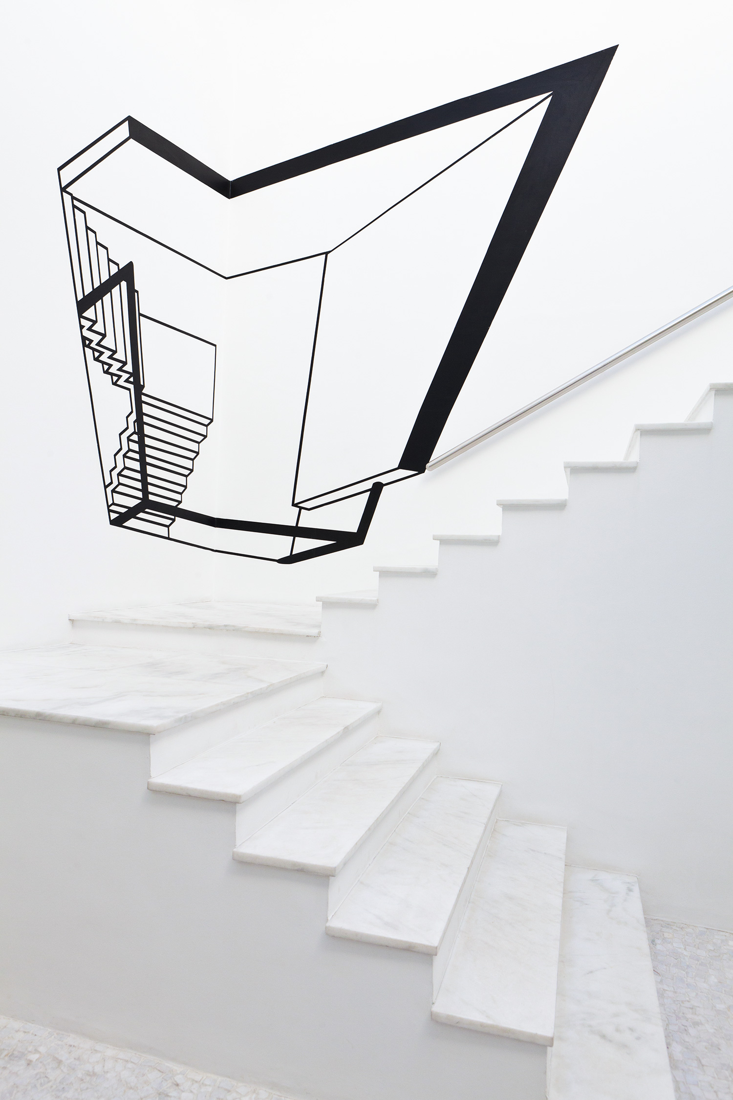
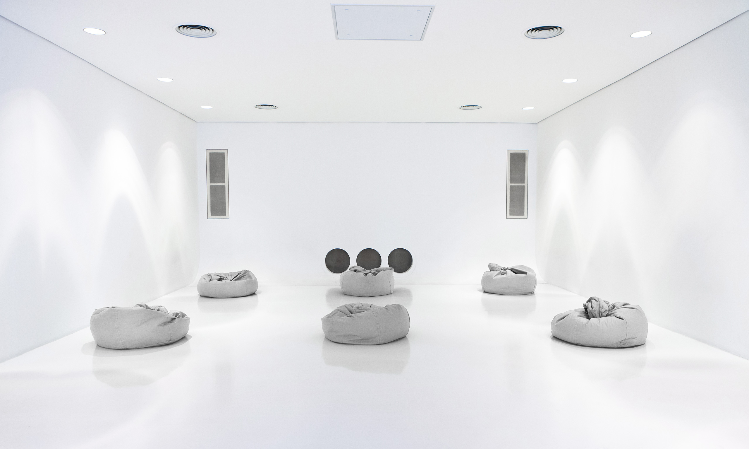
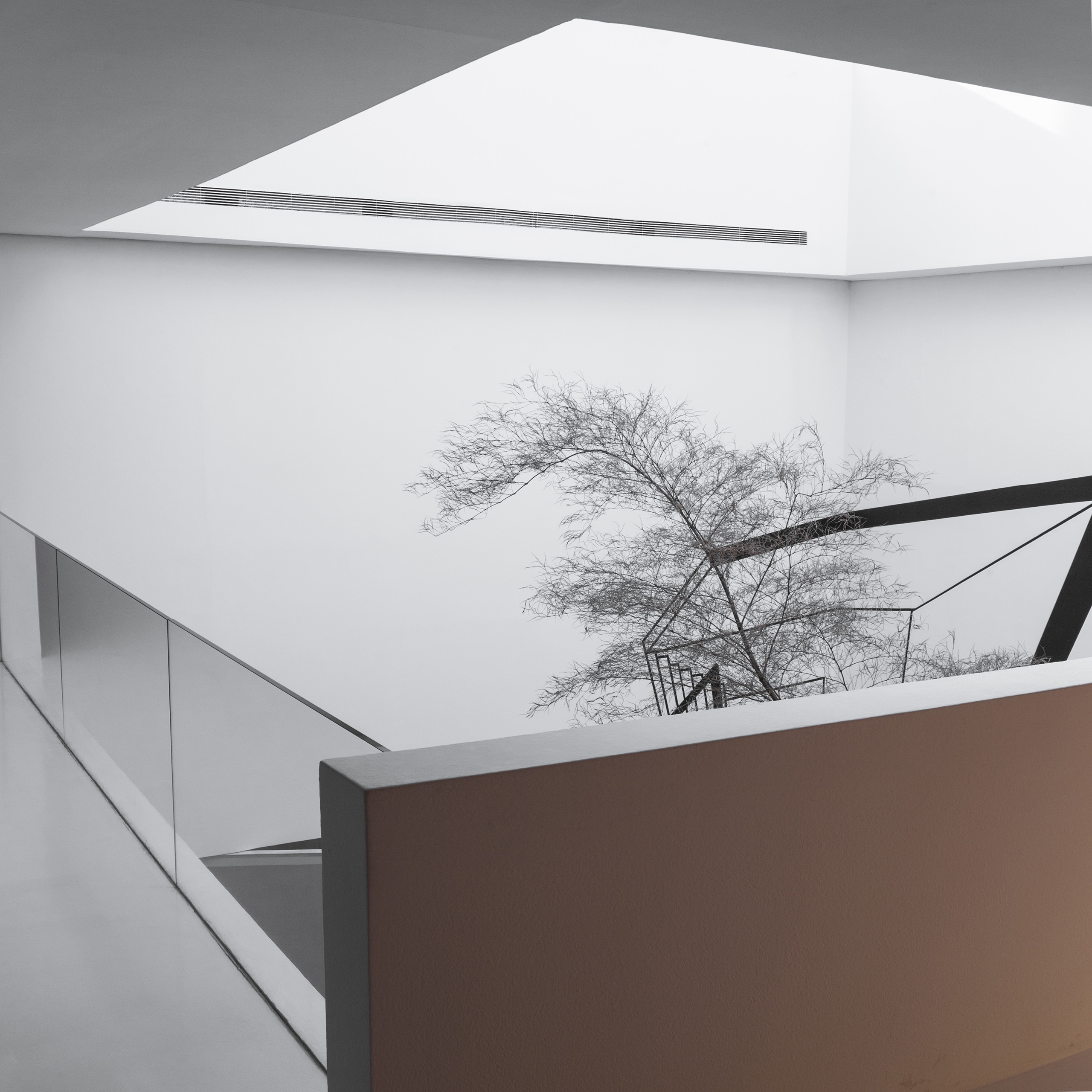
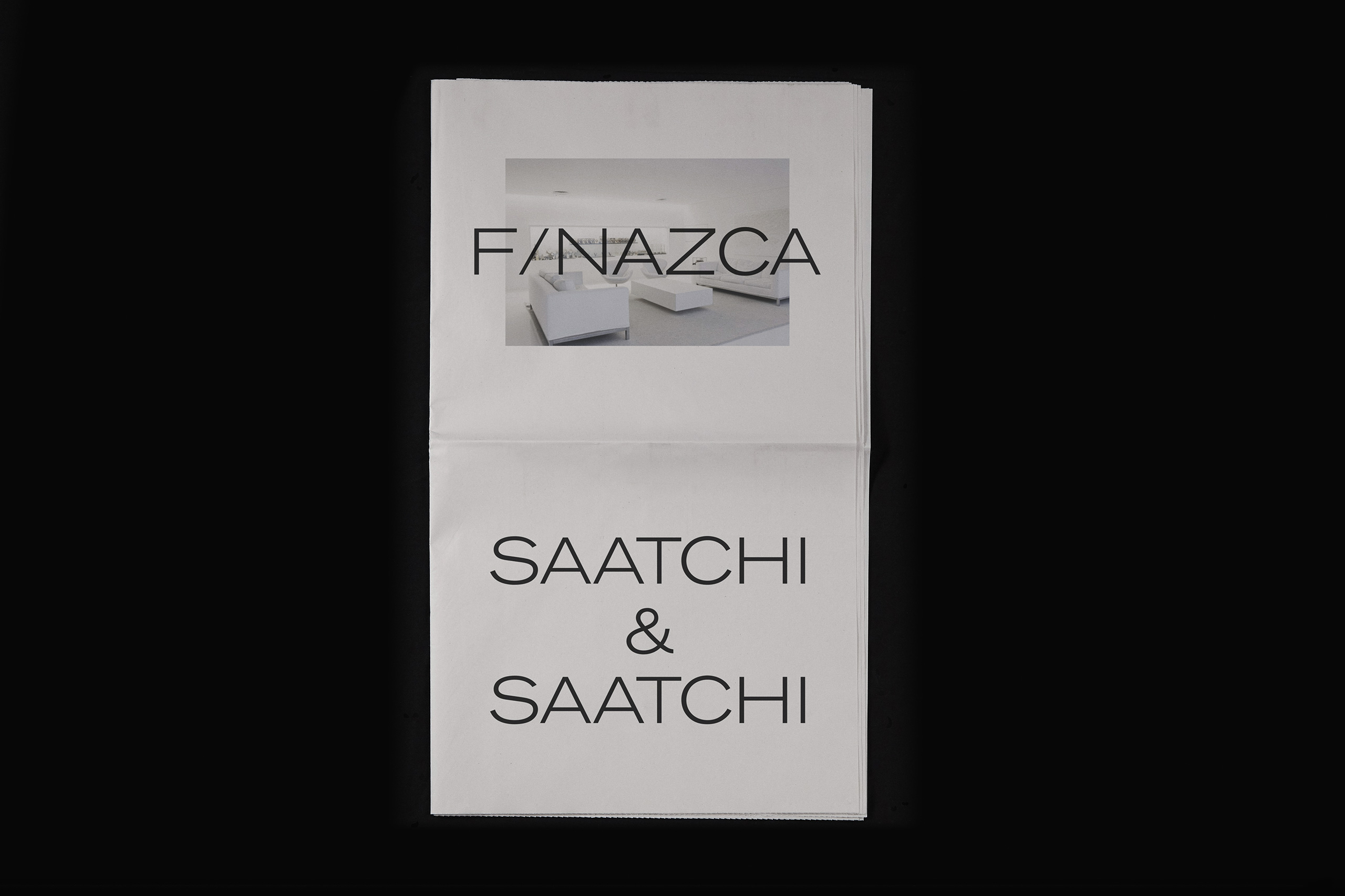
The agency interior follows the white cube concept, like a contemporary art museum. The interior is filled up with artworks by established and emerging artists every 3 months.
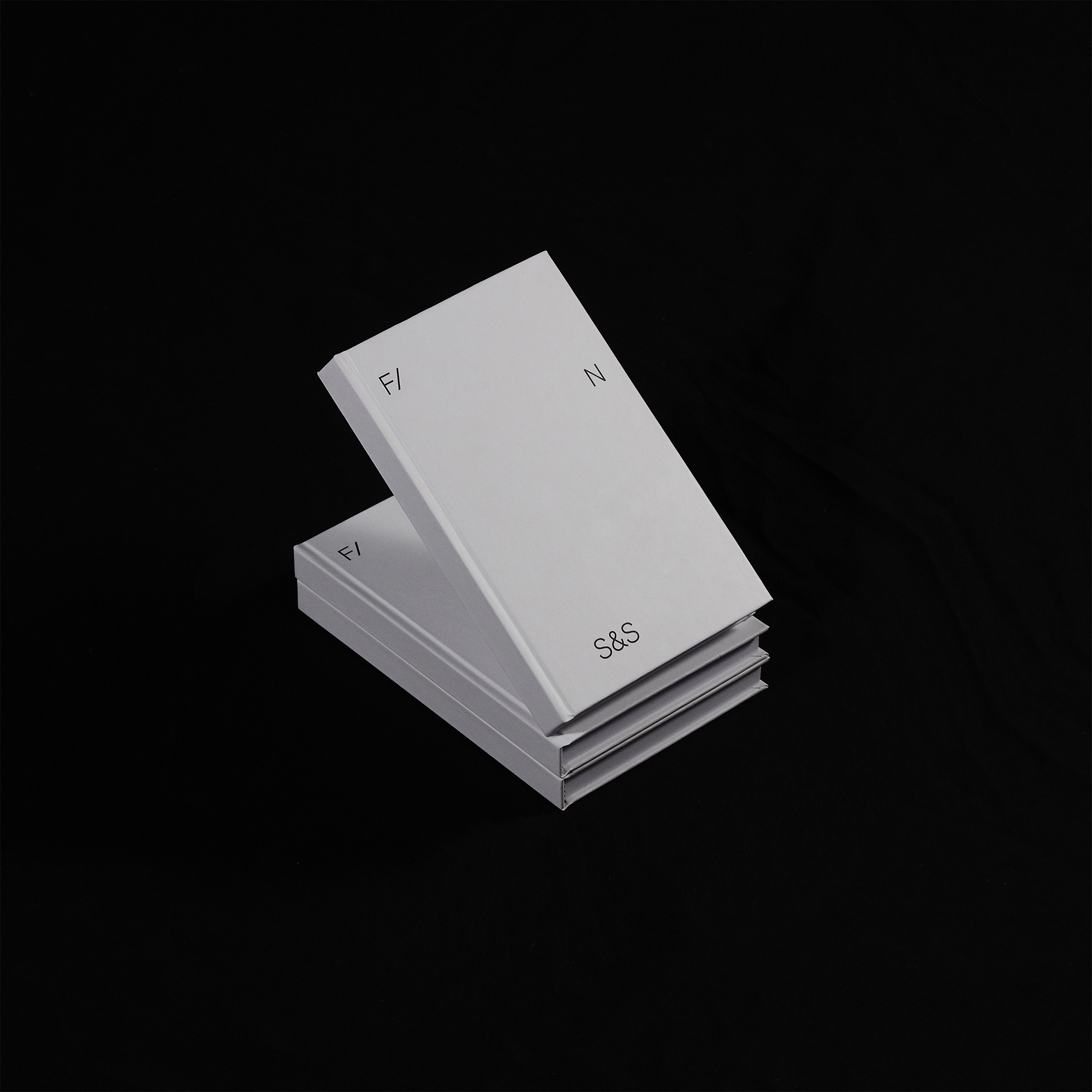
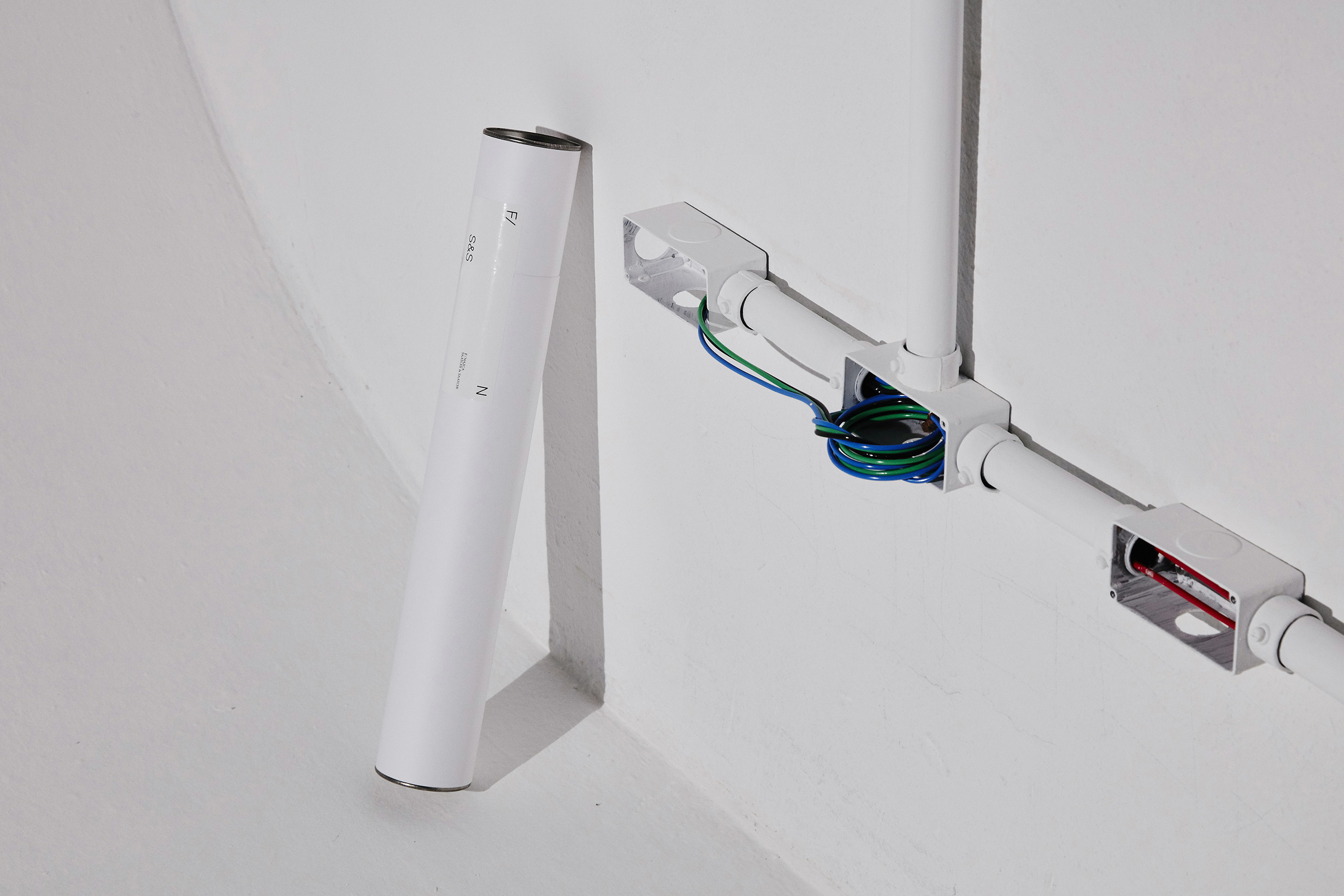
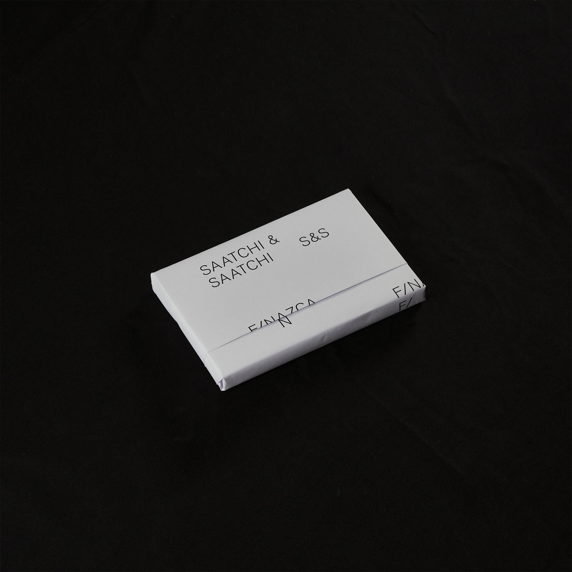
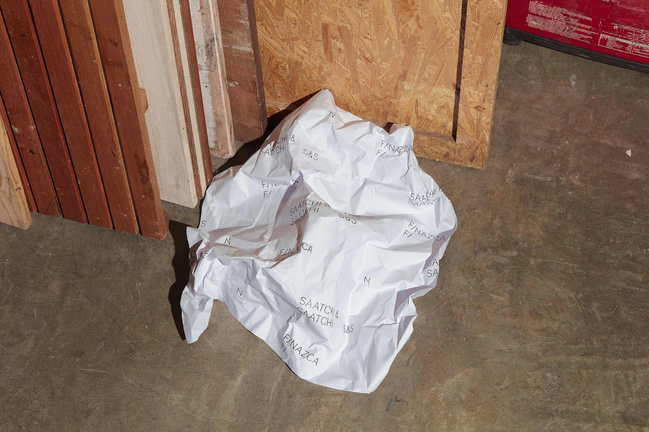
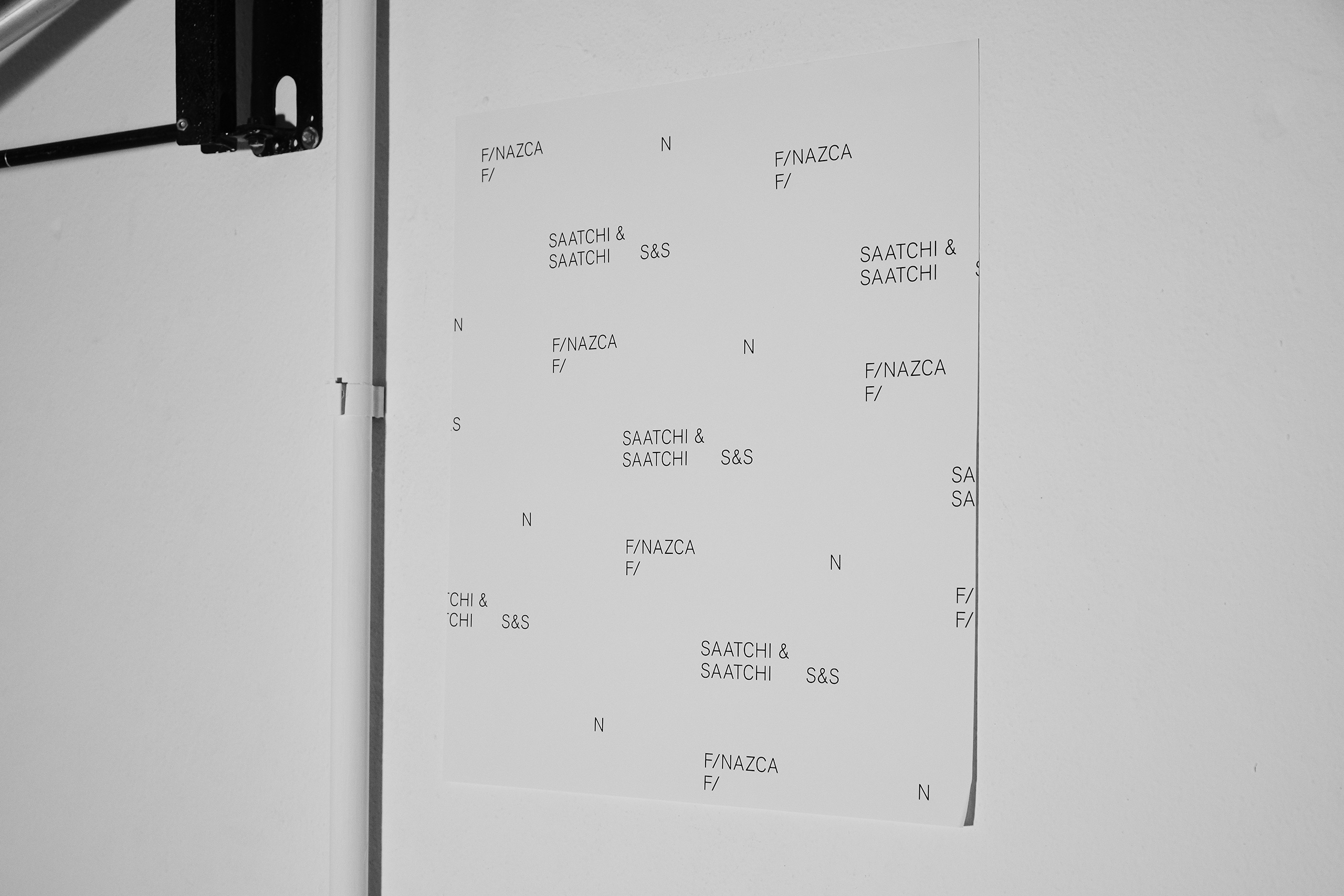
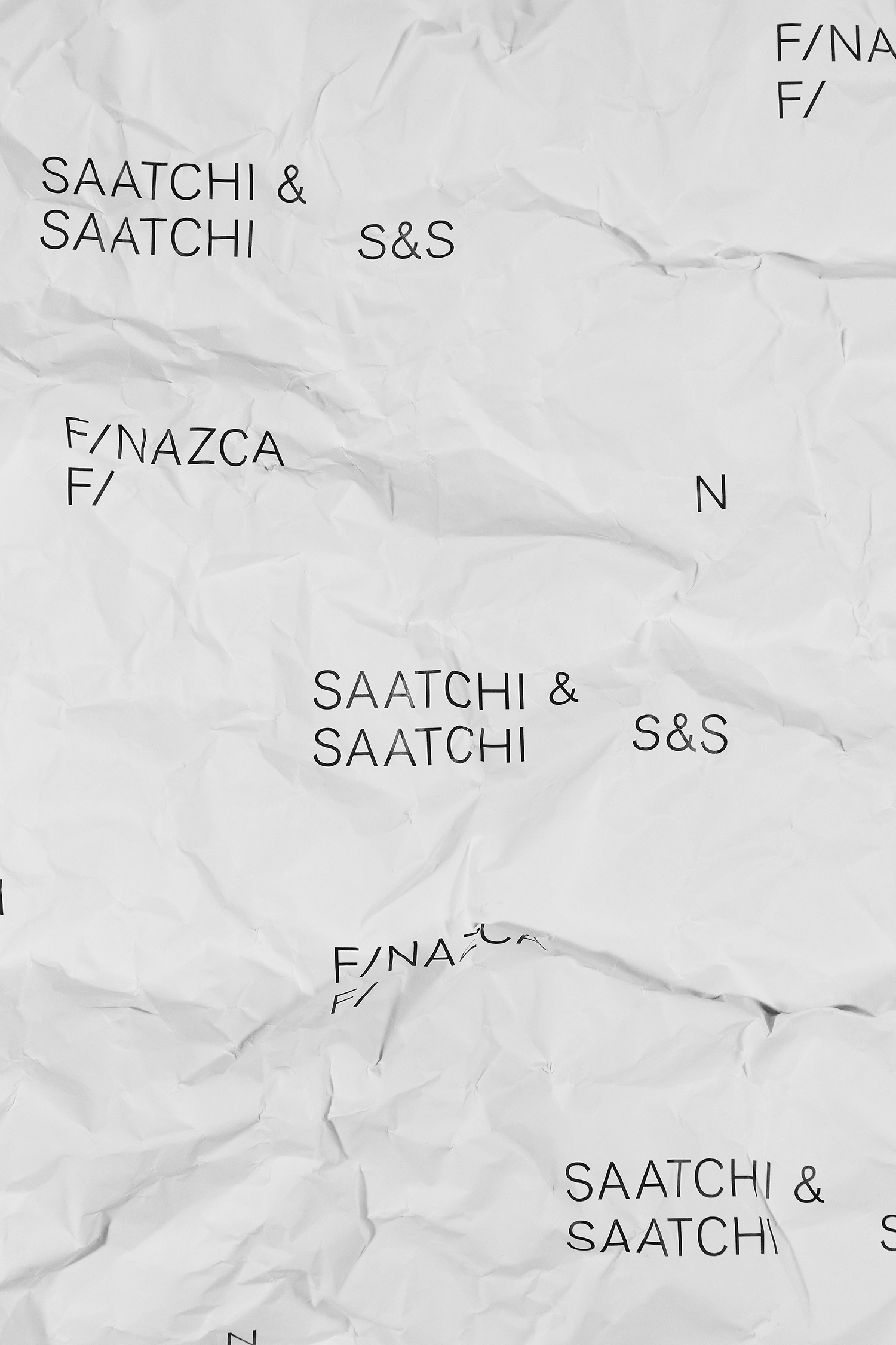
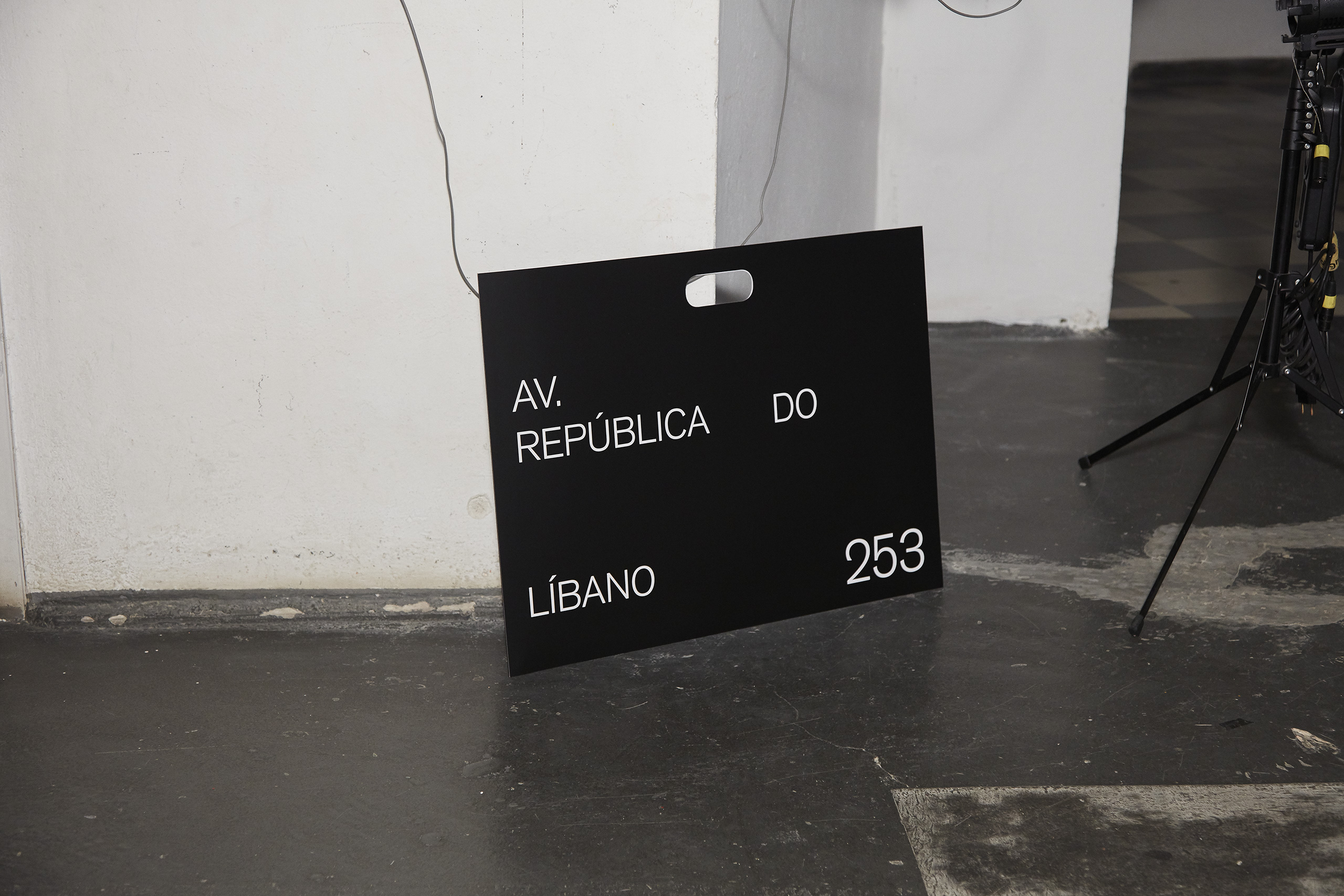
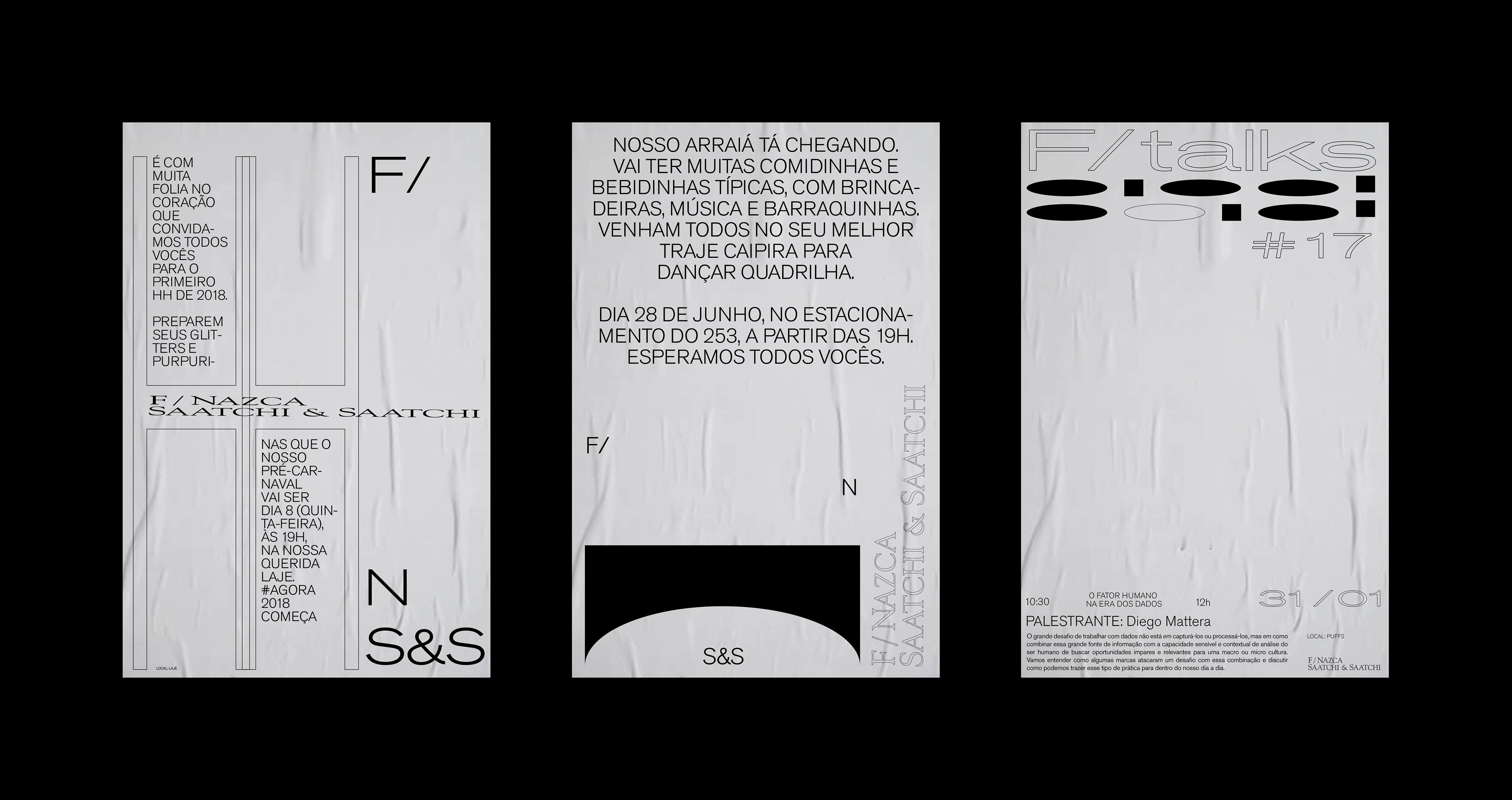
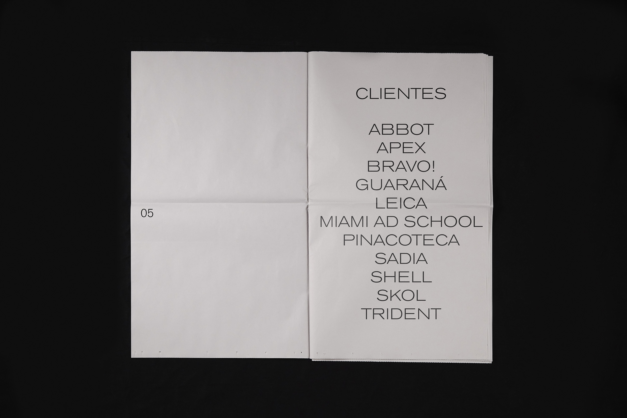
The agency building follows this concept of an art gallery, where almost everything is white and they also have contracts with art galleries to fill them up every 3 months. The new identity follows the same minimalist and brutalist aesthetics as the building.
The agency building follows this concept of an art gallery, where almost everything is white and they also have contracts with art galleries to fill them up every 3 months. The new identity follows the same minimalist and brutalist aesthetics as the building.
The agency building follows this concept of an art gallery, where almost everything is white and they also have contracts with art galleries to fill them up every 3 months. The new identity follows the same minimalist and brutalist aesthetics as the building.
The agency building follows this concept of an art gallery, where almost everything is white and they also have contracts with art galleries to fill them up every 3 months. The new identity follows the same minimalist and brutalist aesthetics as the building.
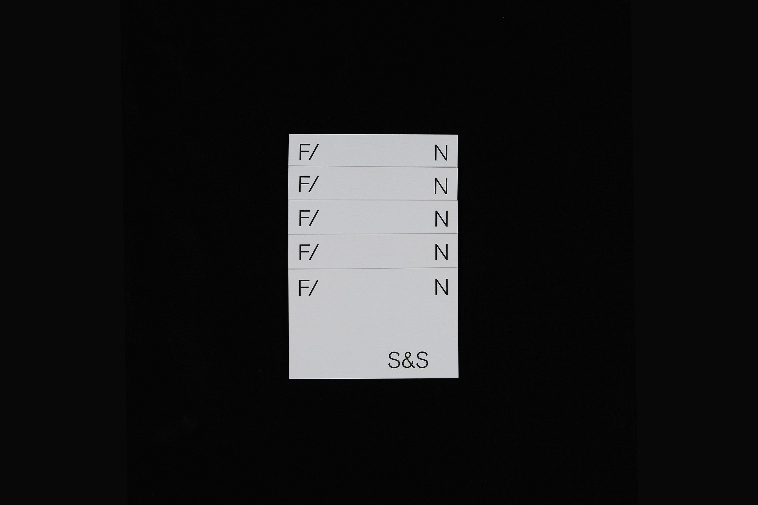
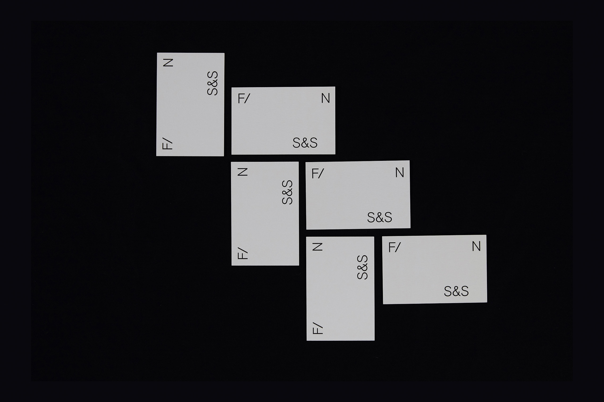
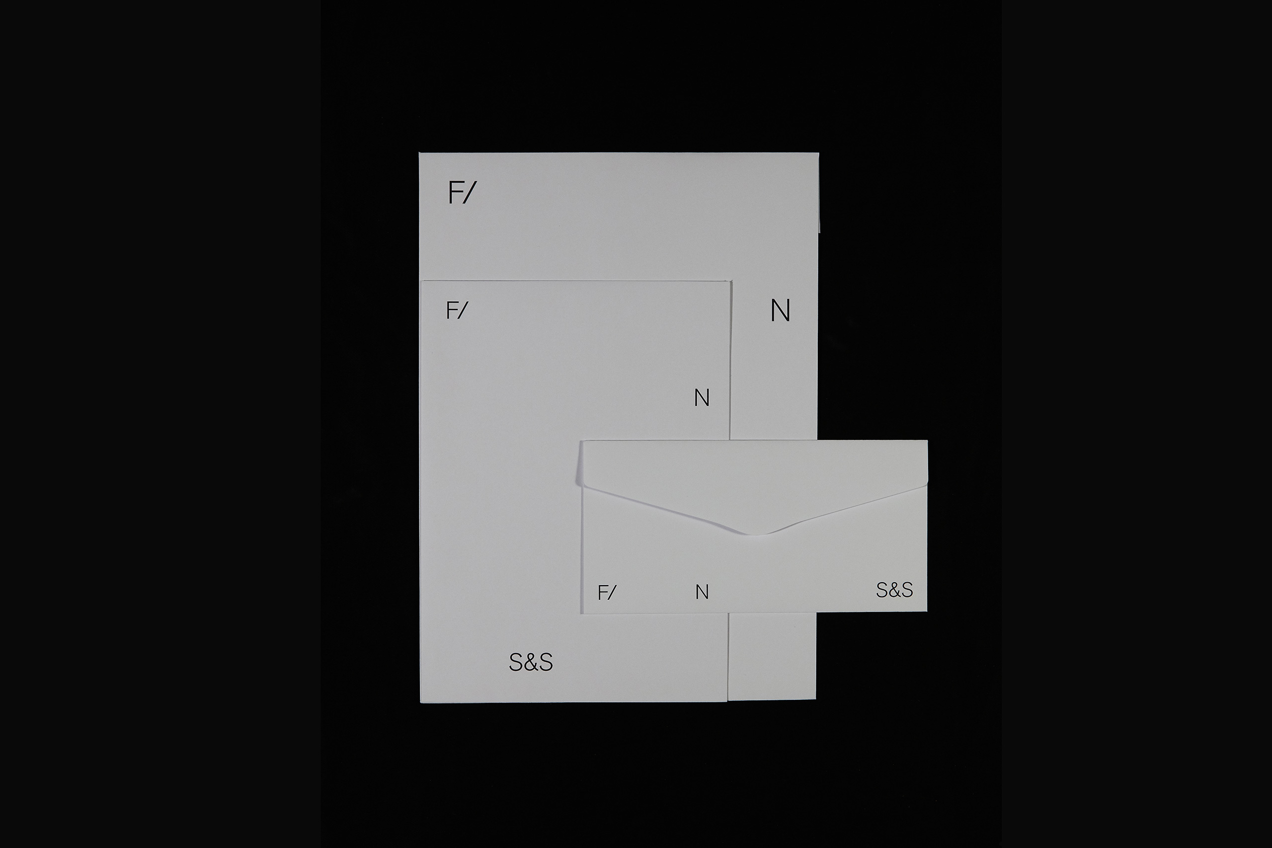
The new identity follows the minimalist and brutalist aesthetics of the building.
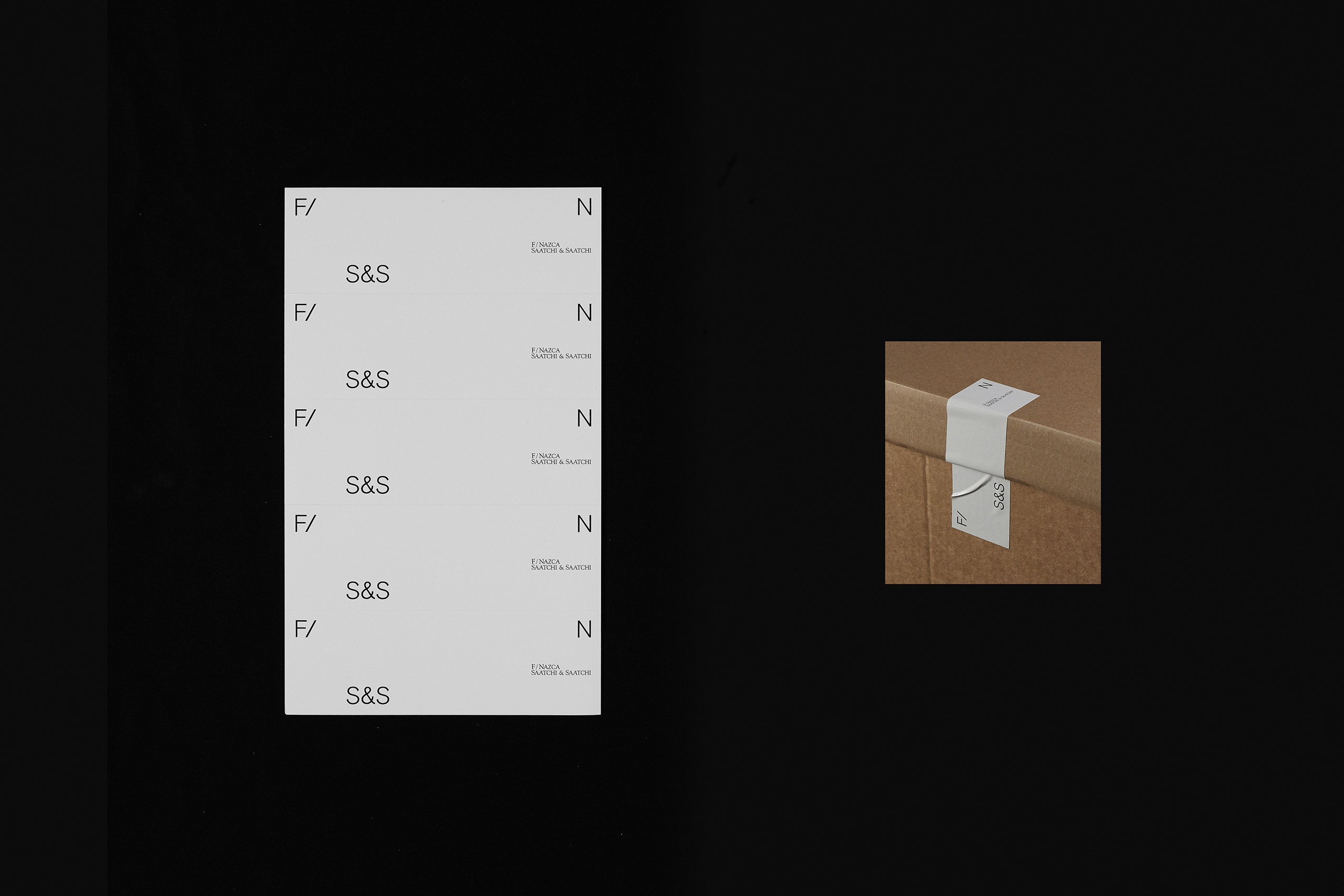
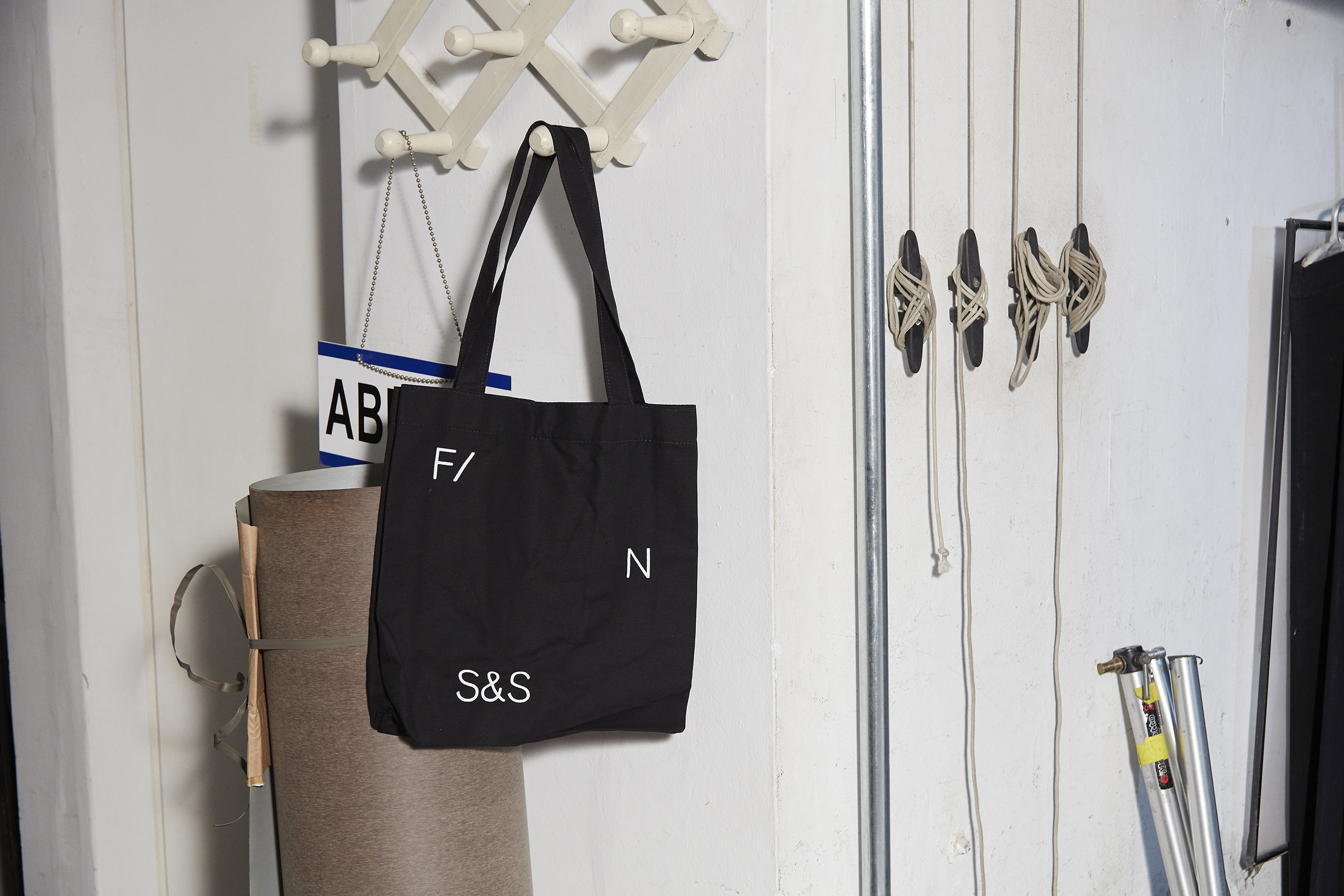
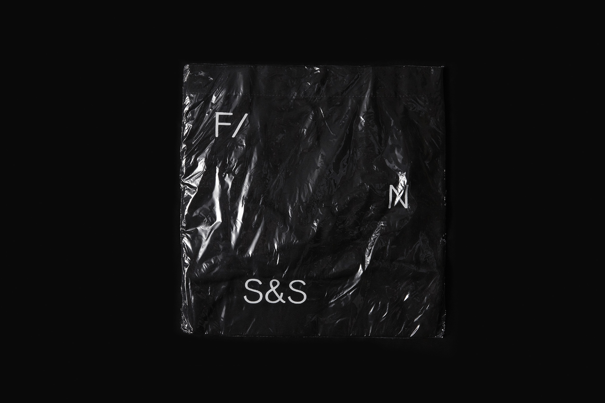
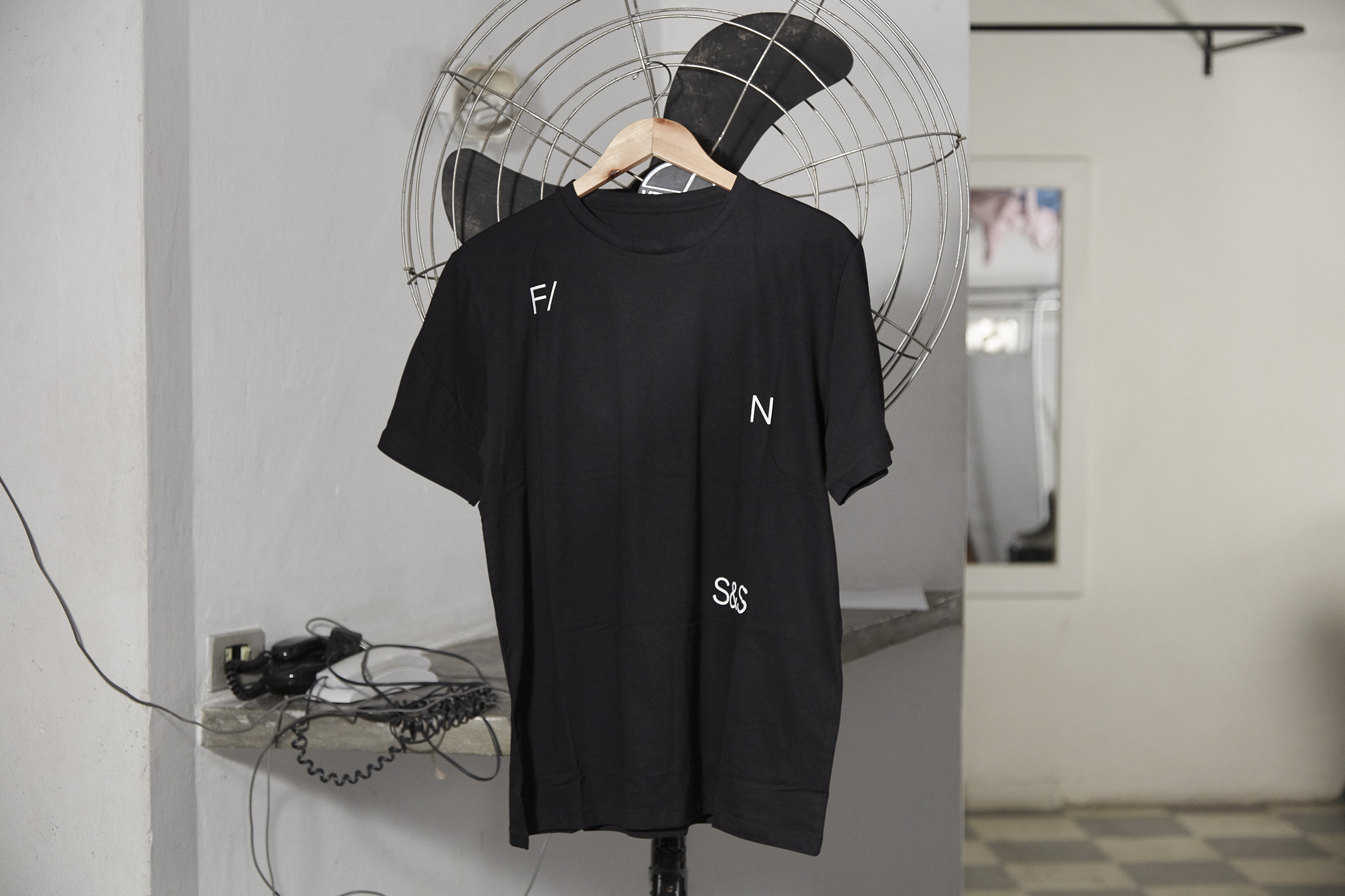
The strength of the identity lies in the pairing of a modernist aesthetics derived from the agency building with an exotic mid-century-inspired typeface.
The strength of the identity lies in the pairing of a modernist aesthetics derived from the agency building with an exotic mid-century-inspired typeface.
The strength of the identity lies in the pairing of a modernist aesthetics derived from the agency building with an exotic mid-century-inspired typeface.
The strength of the identity lies in the pairing of a modernist aesthetics derived from the agency building with an exotic mid-century-inspired typeface.
The strength of this project lies in the pairing of a modernist aesthetics derived from the agency building with an exotic mid-century-inspired typeface.
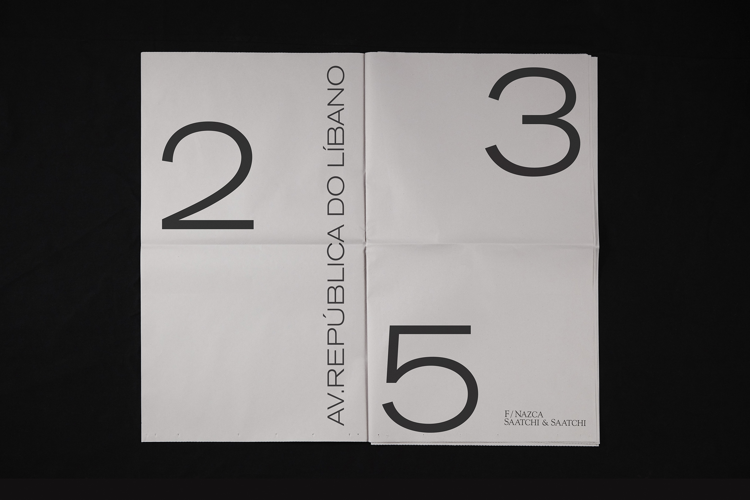
Also the interior design evokes an art gallery mood with tons of white space. By removing all that was not essential, we sticked the whole system to this minimalist aesthetics.
Also the interior design evokes an art gallery mood with tons of white space. By removing all that was not essential, we sticked the whole system to this minimalist aesthetics.
Also the interior design evokes an art gallery mood with tons of white space. By removing all that was not essential, we sticked the whole system to this minimalist aesthetics.
Also the interior design evokes an art gallery mood with tons of white space. By removing all that was not essential, we sticked the whole system to this minimalist aesthetics.
